Mixpael's design system is comprised of: a Style Guide, engineered 'atomic' components, a handful of sticker-sheets, an audit and proposal framework, and a training course for all new hires. When I first joined Mixpanel, there was no design system; there was only 6 years of design debt: piles of unused code (colors, type, icons, etc.) and a mix of Photoshop, Illustrator, and Sketch files.
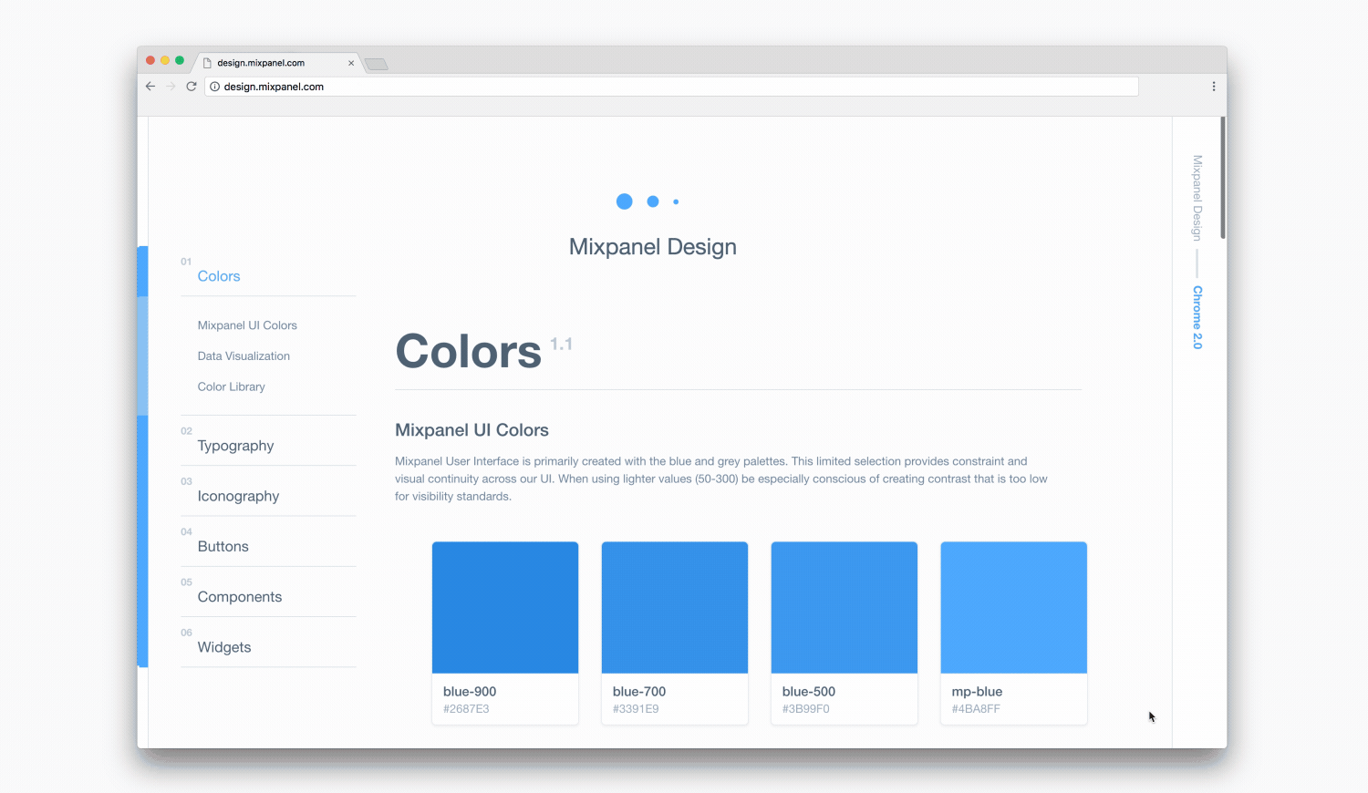
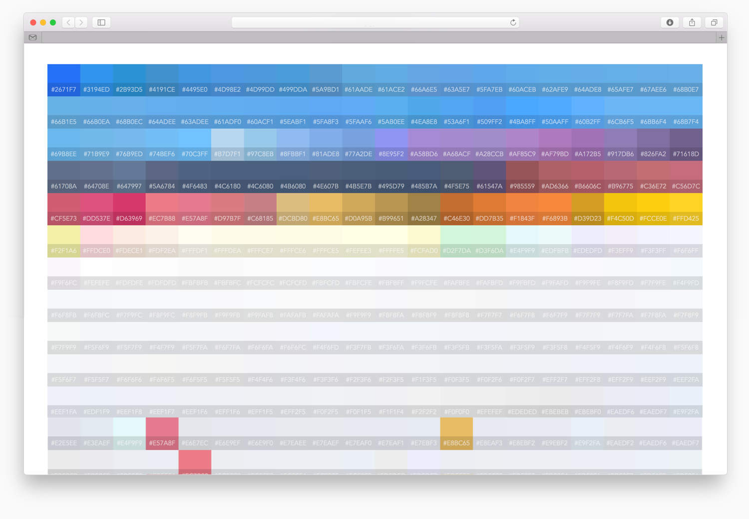
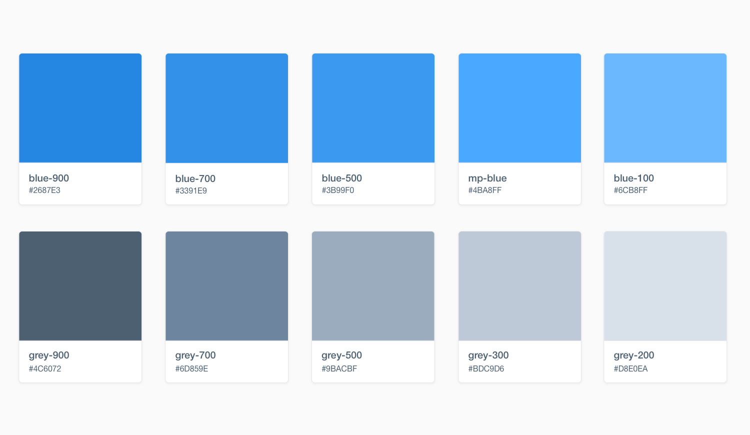
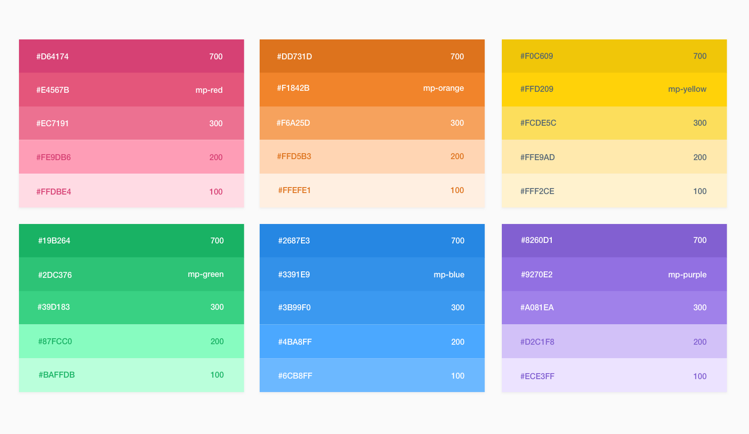
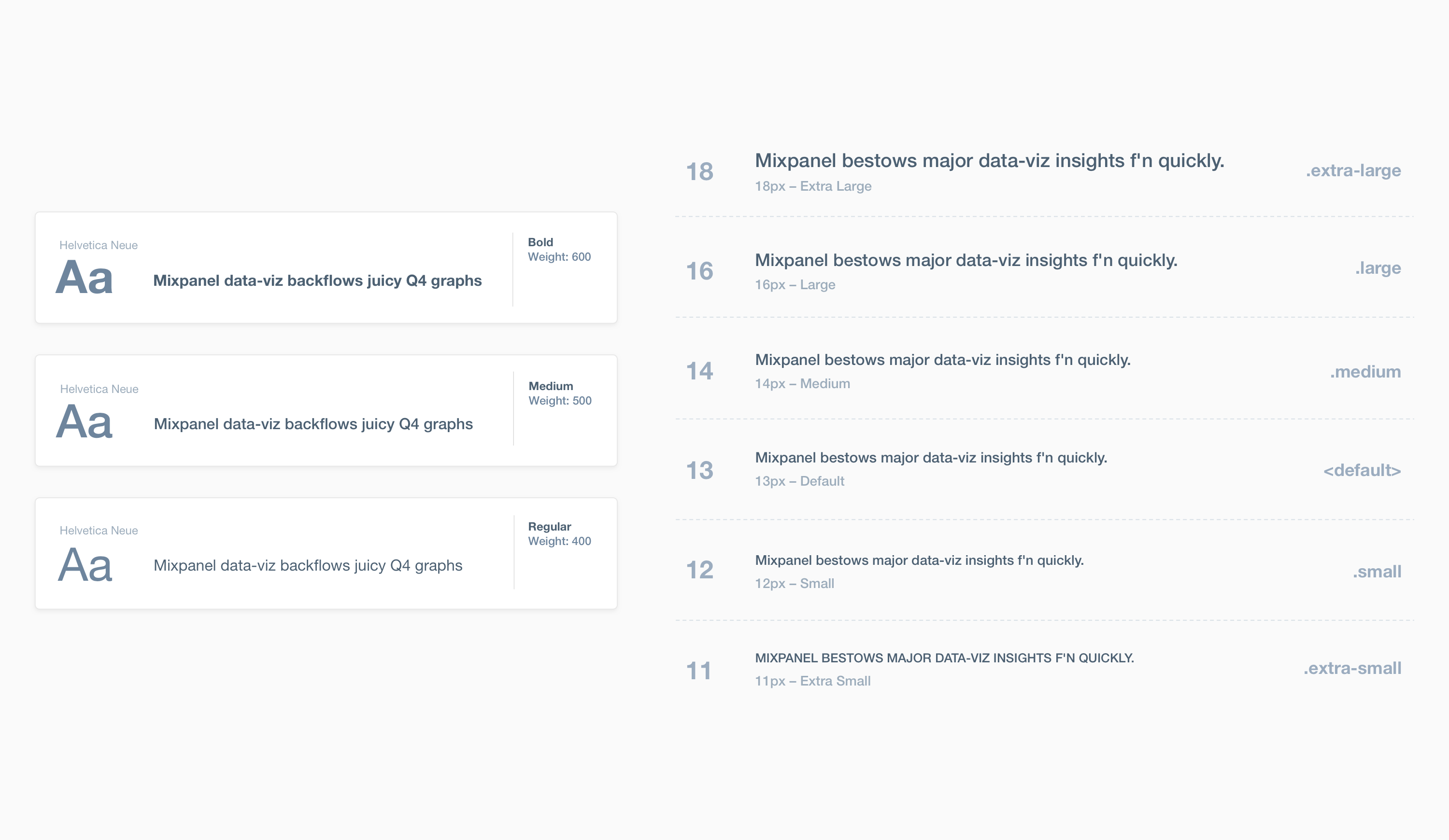
I began by looking at the code: I ran the stylesheets through CSSstats and determined that Mixpanel had: 2,105 unique colors, 419 unique backgrounds (colors), 42 unique fonts in 35 unique sizes, and 66 unique z-index declarations – That's too many! I then organized the color, by color, in order to find opportunities for consolidation. After creating a chrome extension that allowed us to preview the consolidated colors, I landed on a palette of just 10 UI colors, 5 background colors, and a rainbow library to support all infographics.
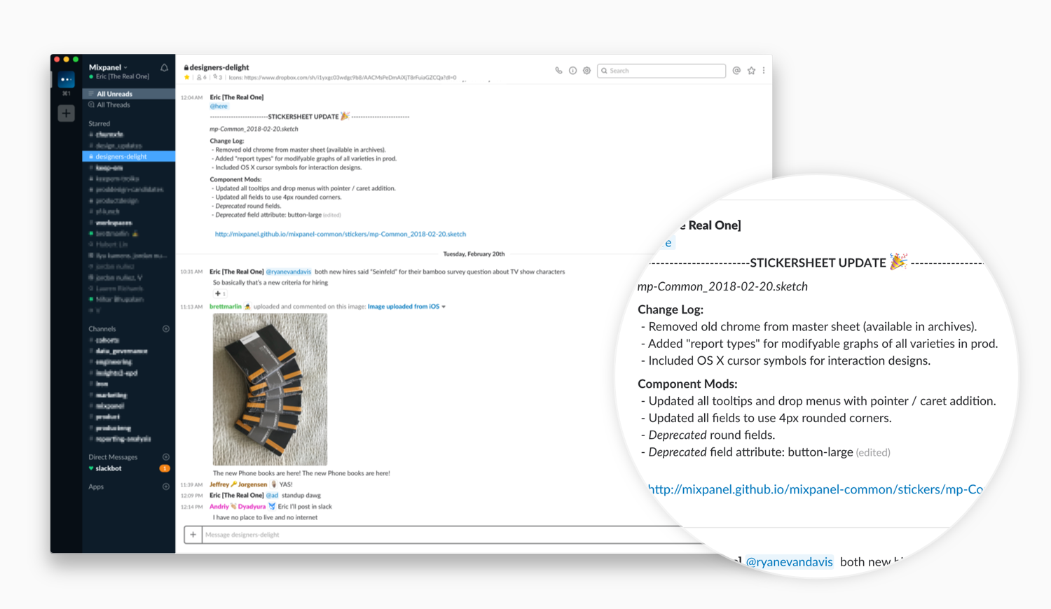
Pushing Asset Updates
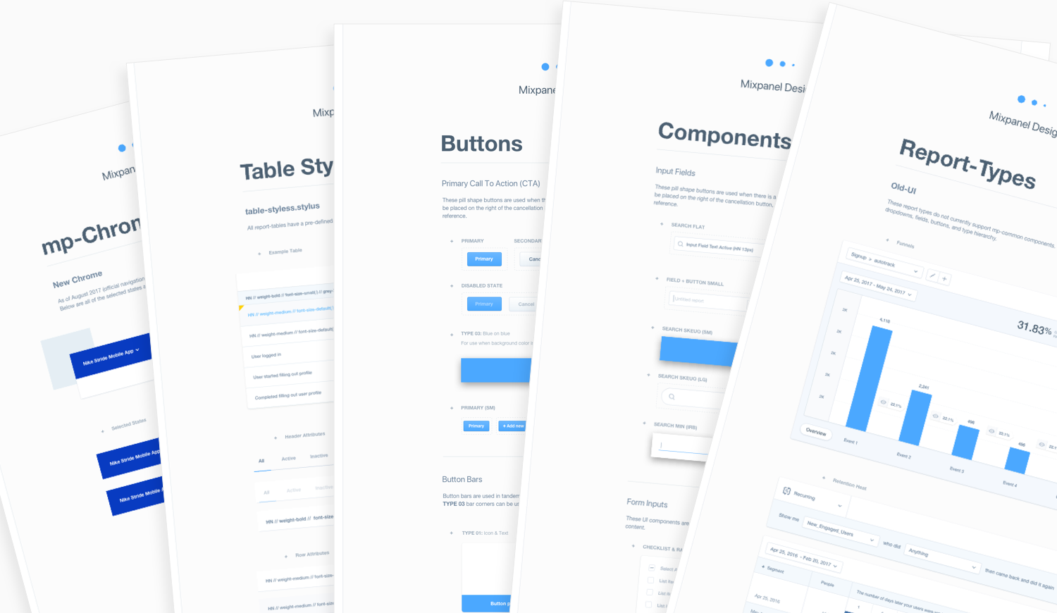
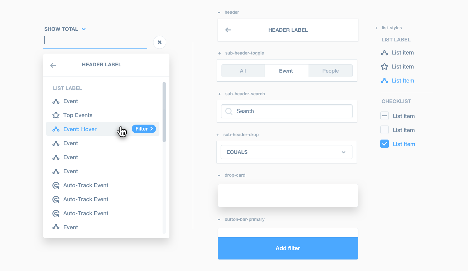
Once the basics of the design system (colors, type, icons, buttons, fields, etc.) were stapled down in code and in sticker-sheets, I began creating documentation. The Mixpanel Style Guide is the one place every designer and engineer can find our components with language about how to use them and code snippets that outline proper use & possible attributes. We also created widgets (pre-compiled groupings of components), that allowed engineering to share more robust, functional feature, portions of code across multiple projects.
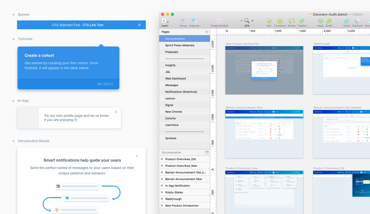
The final element of the design system is the Audit Framework. This was a series of repeatable steps that allowed the design team to contribute new components and modify existing ones. The example below is an audit that surveyed the product for all educational mechanics, to assist us in defining the proper amount of on-boarding and discovery a user would receive, and in which order.